

One rule of thumb for designing window panes / grilles (aka muntin bars)
/Today I’m working on a remodel project here in downtown Dexter for a great local couple, Harry and Ella Rolfes who are remodeling a house they’ve owned as a rental for years but have decided to renovate into their own downtown home.
The structure of the roof is too badly undersized and leaves little room upstairs, so we’re taking the rather bold step of removing it completely and replacing it with a full second story, complete with new truss roof.

Existing house w/ half story upstairs and bad roof

Proposed house w/ full second floor and truss roof
As part of that we’ll also be incorporating a new window design into the building. Naturally, we’ll be incorporating Panes into the windows.
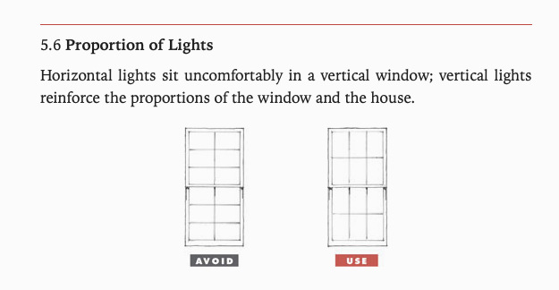
Why? To help soften the design, to give it life and presence, to incorporate rhythm and proportion, and to provide direction for the design of the size/shape of the windows themselves. From Get Your House Right, the following:

So next was to pick the specific window - for this project, we’re using Pella. While going through the Pella literature I came across something I would consider a common error in Window Pane design. What’s shown here is their ‘Traditional Grille’ pattern - and I’ve stacked it up next to the window I’ll be using.
Before I go on - does that look correct to you? If that window was installed on your house, would you think it was beautiful? Would you think it was ugly? Would you know the difference?


“...the correct term for the ‘Grille’ is ‘Muntin Bar’, but around here the builders will look at you strange if you call them that, so I just bite my tongue and call them ‘Grilles’. You could call them ‘panes’ and it might be a good compromise word - maybe I’ll start doing that... I just feel silly calling them Grilles...”
Looking at the upper windows, if I took Pella’s suggested pattern the front of the house would look like this:

Not bad. However, there’s still something they’re doing that makes them feel wrong. It’s something most people have no idea about, and it’s the easiest thing in the world you can do to make sure all your windows look cohesive + correct.
That is: Always use a vertical rectangle or a square when setting out your window panes. Never use a rectangle which is laying on its side.
Applying that to the window design gives us a much more composed design that feels (and is) authentically considered.

There are more nuanced rules for setting out the proportions, like matching them across floor levels and incorporating panes into different window types - but if you just remember this rule of thumb you’ll be 80% of the way there.
Remember: